 SAFOS
SAFOS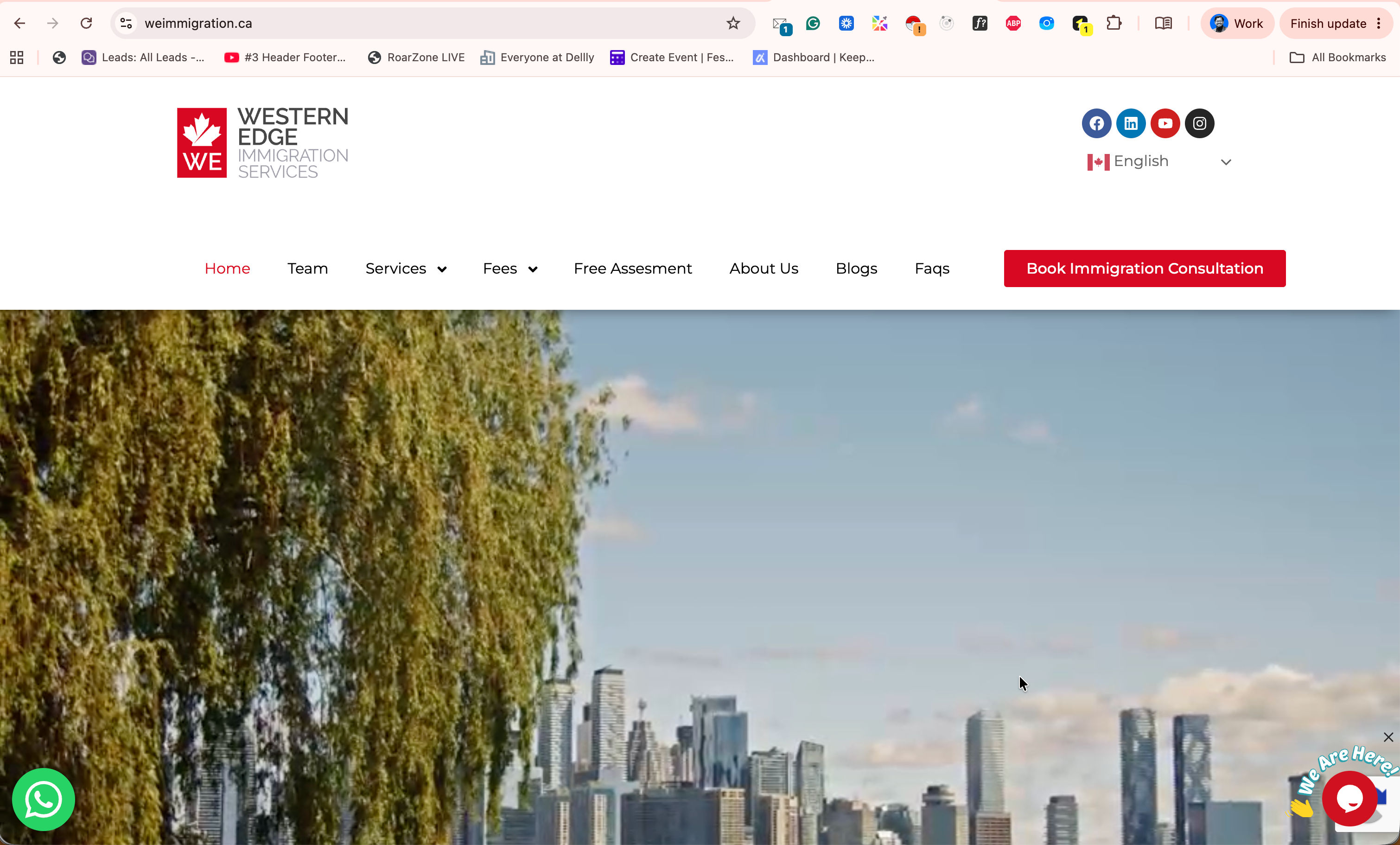
CASE STUDY / ACTIVE
WE Immigration — Canadian Immigration Consultancy Website
Designed and developed the digital presence for Western Edge (WE) Immigration Services, a Canadian immigration consultancy led by a Regulated Canadian Immigration Consultant (RCIC).
- Status
- active
- Focus
- Wordpress · redux · UX · Content planning · Project managment
Project story
Immigration is a high-trust professional service.
People visiting an immigration consultancy website are usually not casually browsing. They may be making decisions involving their career, education, family, business, or long-term future.
For Western Edge (WE) Immigration Services, the website therefore needed to do more than introduce the company.
It needed to answer several questions immediately:
Who are they?
Are they qualified?
Can they help with my case?
How does the process work?
What will it cost?
What should I do next?
WE Immigration provides services across permanent residence, temporary residence, business immigration, visa-refusal management and related Canadian immigration matters. The practice is led by Kafil Haider, an RCIC registered with the College of Immigration and Citizenship Consultants.
My goal was to turn those services into a structured digital experience that could support both credibility and client acquisition.
Why We Built ItA professional-services website has a different job from a normal corporate website.
Visitors are not primarily looking for features.
They are looking for confidence.
Immigration services can also be difficult to understand because there are many different pathways, requirements, eligibility conditions and service types.
Without a clear structure, a potential client may arrive on the website and still be unsure:
- which service applies to them
- whether the consultant handles their case
- what the process looks like
- how much consultation costs
- whether they need an assessment first
- how to speak with someone
- whether the consultancy is legitimate
The website needed to remove as much of that uncertainty as possible.
The Problem I Tried to SolveThe main challenge was turning a complicated consultancy business into a simple customer journey.
The business offers different immigration services to people with very different needs.
One visitor may be exploring:
Permanent Residence
while another may need:
Study Permit
another:
Family Sponsorship
and another:
Business Immigration or a refused application.
Treating all of those people with the same generic contact form would create unnecessary friction.
So the real design problem became:
My ApproachHow do we help a visitor understand where they belong and move them naturally from information to consultation?
I structured the website around the client's decision-making process instead of simply building pages around the company's internal structure.
The core journey became:
Discover → Understand → Build Trust → Assess → Book → Become a Client
This became the foundation for how services, content and calls to action were organized.
1. Clearly Defining the BusinessOne of the first priorities was making it obvious what WE Immigration actually does.
The website positions the company around Canadian immigration consulting rather than burying its purpose behind generic corporate messaging.
Its main service categories include:
- Permanent Residence
- Temporary Residence
- Business Immigration
- Visa Refusal Management
The site then provides more specific information around areas such as Express Entry, PNP, family sponsorship, visitor visas, study permits, PGWP and citizenship.
This gives visitors a clear entry point based on their situation.
2. Building Trust Around the ConsultantFor a consultancy business, the person providing the professional service is part of the product.
Visitors need to know who will be advising them and whether that person has the appropriate credentials.
The website therefore gives strong visibility to the principal consultant's:
- RCIC status
- CICC registration
- professional background
- immigration experience
- business experience
- international experience
The site also provides a direct verification path to the regulator's register.
This was important because credibility should not depend only on marketing statements.
It should be verifiable.
3. Turning Services Into a Client JourneyInstead of presenting immigration services as isolated pages, the website explains the broader process.
The client journey is structured around:
Pre-Assessment → Consultation → Application → Decision
The first step allows a potential client to provide background information.
The consultation then provides an opportunity to discuss the person's profile, options and next steps before moving into a formal engagement.
This makes the website part of the operational workflow rather than just an online brochure.
4. Building the Pre-Assessment ExperienceOne of the most useful parts of the project was the pre-assessment system.
A normal contact form might only collect:
Name → Email → Phone → Message
That is not enough for an immigration consultant to understand whether an inquiry is relevant.
The assessment captures more structured information such as:
- residence and citizenship
- education
- occupation
- Canadian work history
- language ability
- family information
- immigration category
- Canadian job offer
- relevant financial information
- additional case details
This provides the consultancy with more context before the conversation even begins.
For the client, it also creates a clearer starting point than simply sending a vague message.
5. Consultation BookingAnother major goal was removing friction between interest and consultation.
Instead of requiring visitors to:
send an email → wait for a response → negotiate a time → confirm the meeting
they can move directly from the website into consultation booking.
The live website currently provides different consultation types, including shorter case-specific sessions, strategy consultations and Express Entry profile reviews, with appointment booking integrated through the scheduling flow.
The customer journey becomes:
Choose Consultation → Select Time → Book
This is much more useful for a professional service business than relying only on a contact form.
6. Transparent Service PricingProfessional services often create unnecessary friction when potential clients have no idea what anything costs.
WE Immigration provides dedicated fee information for multiple immigration services and clearly prices its initial consultation options.
This helps filter inquiries.
Someone who books already has a better understanding of the service and expected cost.
For the business, that means conversations can start further down the sales funnel.
7. Business ImmigrationBusiness immigration required different communication from standard immigration services.
Entrepreneurs and investors may be exploring options such as establishing, acquiring or expanding a business in Canada.
These cases can also be more complex and require a more personalized assessment.
Rather than trying to reduce every case to a fixed package, the website directs business-immigration prospects toward consultation before a custom service quote is prepared.
This was an important content decision.
Not every service should be forced into the same sales model.
8. Content & EducationImmigration decisions usually require research before a visitor is ready to speak with a consultant.
Because of that, educational content became part of the website strategy.
The website includes articles covering topics such as:
- travelling or immigrating to Canada
- family sponsorship
- Canadian work permits
- LMIA
- immigration programs
The blog therefore serves two purposes:
Education + Organic discovery
Visitors can first learn through content and later move toward assessment or consultation when they are ready.
9. Supporting an International Client BaseAlthough the consultancy focuses on Canadian immigration, potential clients can come from different countries.
The website currently communicates office/contact presence across Canada, Bangladesh, Bahrain and the United Kingdom.
That meant the digital experience needed to feel accessible to an international audience rather than being designed only for local Canadian visitors.
The UX ChallengeThe hardest part of a professional immigration website is balancing information and conversion.
If there is too little information, the website does not establish enough trust.
If there is too much information, visitors become overwhelmed.
The solution was to progressively guide users.
First
Explain what the consultancy does.
Then
Show the relevant service.
Then
Establish professional credibility.
Then
Explain the process and fees.
Finally
Give the user a clear next action:
Complete an Assessment or Book a Consultation.
What I SolvedThe biggest improvement was turning the website from an information destination into a business acquisition system.
Instead of
A visitor reading several pages and eventually searching for an email address.
The experience becomes
Service → Information → Assessment → Consultation → Client
Instead of
Every visitor submitting the same generic inquiry.
The website provides
Structured pre-assessment information that gives the consultant more context before engagement.
Instead of
Visitors wondering about the consultant's professional status.
The website communicates
RCIC credentials and provides a route to independently verify professional standing.
Instead of
Manually coordinating every consultation.
The website provides
Dedicated consultation options connected directly to appointment scheduling.
Designing for Conversion Without Losing TrustThis was particularly important.
An immigration website should not feel like an aggressive sales funnel.
The visitor may be making one of the biggest decisions of their life.
The design therefore needed to encourage action without constantly pushing:
BOOK NOW
everywhere.
The stronger conversion strategy was:
Provide useful information → establish authority → explain the process → make the next step obvious.
That produces a more credible experience for this type of business.
Business ImpactThe website now supports several parts of WE Immigration's business digitally:
Brand Presence
Clearly explains the consultancy and its services.
Lead Generation
Visitors can submit inquiries and detailed pre-assessments.
Qualification
The assessment provides useful information before consultation.
Consultation Sales
Visitors can book paid consultation sessions.
Service Discovery
Dedicated pages explain different immigration pathways.
Authority
Professional credentials, educational content and service information help establish credibility.
In other words, the website is not just presenting the business.
It participates in the business process itself.
My RoleMy work across the project included areas such as:
Requirement Analysis · Website Strategy · Information Architecture · UX Planning · UI Implementation · Service Structuring · Lead-Generation Flow · Assessment Forms · Consultation Booking Integration · Responsive Development · Content Architecture · Deployment
The key challenge was always connecting the technical implementation with the actual business objective.
It was not:
"How many pages can we build?"
It was:
The Result"How can the website turn an uncertain visitor into an informed, qualified consultation lead?"
The final website gives WE Immigration a centralized platform where potential clients can:
Understand the business → Explore immigration services → Learn about the consultant → Review fees → Complete an assessment → Book a consultation → Contact the team
The site supports both informational and commercial objectives while maintaining the professional credibility required for an immigration consultancy.
What I LearnedThis project reinforced that websites for professional services should not be treated like digital company profiles.
They should reflect how the business actually acquires and serves clients.
A good consultancy website connects:
Trust + Information + Qualification + Conversion
When those pieces work together, the website becomes part of the company's operational system rather than simply a marketing asset.
Closing StatementThe goal was not simply to build an immigration website. It was to create a digital client journey that helps people understand their options, verify who they are dealing with, provide the right information, and move confidently toward a professional consultation.